Table of Contents
The importance of responsive website design cannot be overstated
As users increasingly access websites from a variety of devices, it is essential to provide seamless user experiences across all platforms. In this guide, we will discuss the key concepts, benefits, and best practices of responsive design, helping you to create websites that not only look great but also perform exceptionally well on any device.

What is Responsive Website Design?
Definition and explanation
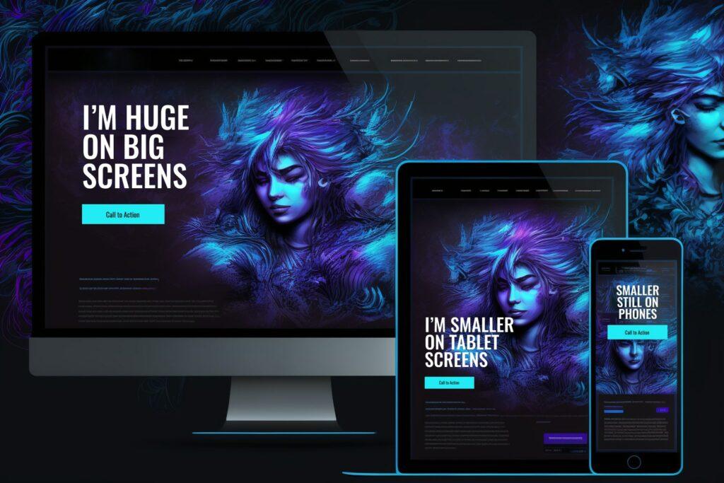
Responsive website design is an approach to web design that ensures a website’s layout, images, and other elements adapt to the user’s device, providing an optimal viewing experience regardless of screen size, orientation, or resolution. This means that your website will look and function consistently across a variety of devices, from desktop computers to tablets and smartphones.
Evolution of responsive design
Responsive design emerged as a response to the rapid growth of mobile devices and the increasing diversity of screen sizes. In the past, web designers would create separate websites for desktop and mobile devices, leading to increased maintenance and inconsistent user experiences. Responsive design has since become the industry standard, allowing for a single website to cater to all device types.
Importance in today's digital landscape
With mobile internet usage surpassing desktop usage, responsive design is more important than ever. Providing a consistent, seamless user experience across all devices not only ensures your website is accessible but also enhances user satisfaction, leading to better engagement, higher conversion rates, and improved brand identity.

Benefits of Responsive Website Design
Improved user experience
Responsive design ensures that users have a positive experience on your website, regardless of the device they use. This means easy navigation, readable text, and optimal image display for every user, leading to higher levels of satisfaction and engagement.
Higher search engine rankings
Google and other search engines prioritize mobile-friendly websites in their rankings. By implementing responsive design, your website is more likely to rank higher in search results, driving increased organic traffic to your site.
Increased conversion rates
A seamless user experience is crucial for conversions. Responsive design ensures that users can easily navigate your website and complete desired actions, such as making a purchase or subscribing to a newsletter, ultimately leading to higher conversion rates.
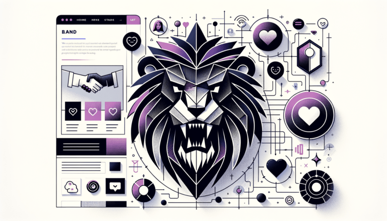
Streamlined brand identity
Responsive design ensures that your website consistently represents your brand across all devices, strengthening brand recognition and loyalty.

Key Elements of Responsive Website Design
Fluid grids
Concept and importance: Fluid grids are a crucial component of responsive design, allowing for flexible layouts that adapt to different screen sizes. They use relative units (like percentages) instead of fixed units (like pixels), ensuring that your website’s layout scales proportionally to the user’s device.
Implementing fluid grids: To create a fluid grid, start by defining the maximum layout width and use relative units to define the widths of various elements. This ensures that the elements will resize and reposition themselves as needed on different screens.
Flexible images
Image scaling techniques: Flexible images are essential for responsive design. They automatically scale and resize based on the user’s screen size, ensuring that images remain sharp and visually appealing on all devices.
Resolution independence: To achieve resolution independence, use vector-based images (such as SVGs) whenever possible, as they scale without losing quality. For raster images, use CSS techniques to ensure they scale proportionately.
Media queries
Adaptive layouts: Media queries are a powerful tool in responsive design, allowing you to apply different CSS rules based on specific device characteristics, such as screen width, height, and resolution.
Device-specific styling: Using media queries, you can create device-specific styles and layouts, ensuring that your website looks and functions optimally on various devices. This includes adjusting font sizes, rearranging elements, and even hiding or showing content based on the user’s device.

The Role of Mobile in Responsive Website Design
Mobile-first design approach
Mobile-first design is an approach to responsive design that prioritizes the mobile experience. By designing for mobile devices first and then progressively enhancing the experience for larger screens, you can ensure that your website is accessible and user-friendly on any device.
Mobile user experience optimization
Optimizing the mobile user experience involves more than just scaling down desktop layouts. Consider factors such as touch screen interactions, limited screen real estate, and varying network speeds. Design for touch-friendly interfaces, prioritize essential content, and optimize performance for a smooth mobile experience.
Accelerated Mobile Pages (AMP)
AMP is an open-source framework that enables faster loading times for mobile web pages. By using AMP, you can improve your website’s performance on mobile devices, leading to better user experiences and higher search engine rankings.

Responsive Website Design and Search Engine Optimization (SEO)
Google's mobile-first indexing
Google now prioritizes mobile-friendly websites in its search rankings, making responsive design essential for SEO. By creating a responsive website, you ensure that your content is accessible and optimized for mobile devices, leading to improved visibility in search engine results.
SEO benefits of responsive design
Responsive design offers several SEO benefits, including faster loading times, reduced bounce rates, and improved user engagement. Additionally, a single, responsive website is easier to maintain and manage, resulting in fewer duplicate content issues and better overall SEO performance.
Tips for optimizing responsive websites for search engines
- Create mobile-friendly content with clear, concise headings and short paragraphs
- Optimize images for faster loading times and lower data usage
- Use semantic markup to help search engines understand your content
- Implement schema.org structured data to enhance search engine listings
Best Practices for Responsive Website design
Navigation and menu design
Create intuitive navigation menus that adapt to different screen sizes. Use collapsible menus, hamburger icons, or dropdowns to simplify navigation on smaller screens while maintaining usability.
Typography and readability
Ensure that your website’s text is easily readable on all devices by using legible font sizes, appropriate line spacing, and sufficient contrast between text and background colors.
Optimal use of whitespace
Whitespace is an essential design element that helps guide users through your website. Use whitespace effectively to create visual hierarchy, improve readability, and enhance the overall user experience.
Performance optimization techniques
Optimize your website’s performance to ensure fast loading times, even on slower connections. Use techniques such as image compression, minifying CSS and JavaScript files, and leveraging browser caching to improve speed.

Responsive Design Tools and Resources
Platforms and Builders
Most website building platforms today support responsive design. We love Elementor, as they support flexbox site building which makes building responsive websites super simple.
Online tools for testing and validation
Use online tools like Google’s Mobile-Friendly Test, BrowserStack, and WebPageTest to test your website’s responsiveness and performance across various devices and browsers.
Design resources and inspiration

Case Studies: Successful Responsive Website Designs
Examples of well-designed responsive websites
- Apple: Showcasing products with a minimalist design that adapts smoothly to different devices
- Airbnb: Creating a seamless booking experience across desktop, tablet, and mobile platforms
- The Guardian: Offering a clean, readable news layout that scales effectively across devices
Lessons learned from real-world implementations
- Prioritize user experience and accessibility on all devices
- Keep performance in mind throughout the design and development process
- Test and iterate to ensure optimal usability across various platforms and browsers
Conclusion
The future of responsive website design
As technology continues to evolve, responsive design will remain a critical aspect of website development. With the advent of new devices and screen sizes, designers and developers must stay up-to-date with best practices and continually refine their skills to create exceptional user experiences.
Recap of key takeaways
Responsive design is essential in today’s digital landscape, offering benefits such as improved user experience, higher search engine rankings, and increased conversion rates. By incorporating fluid grids, flexible images, and media queries, you can create websites that look and function consistently across all devices.
Encouragement to implement responsive design for better user experiences and brand success
By implementing responsive design, you can ensure that your website is accessible, engaging, and optimized for all devices. This not only leads to a better user experience but also contributes to the overall success of your brand. Begin applying these best practices and resources to your web design projects, and watch your online presence thrive.
Ready to take your Website to the next level?
Subscribe for more Useful Content
This publication contains general information only and Dream Engine is not, by means of this publication, rendering accounting, business, financial, investment, legal, tax, or any other professional advice or services. This publication is not a substitute for such professional advice or services, nor should you use it as a basis for any decision, action or omission that may affect you or your business. Before making any decision, taking any action or omitting an action that may affect you or your business, you should consult a qualified professional advisor. You acknowledge that Dream Enigne shall not be responsible for any loss sustained by you or any person who relies on this publication.